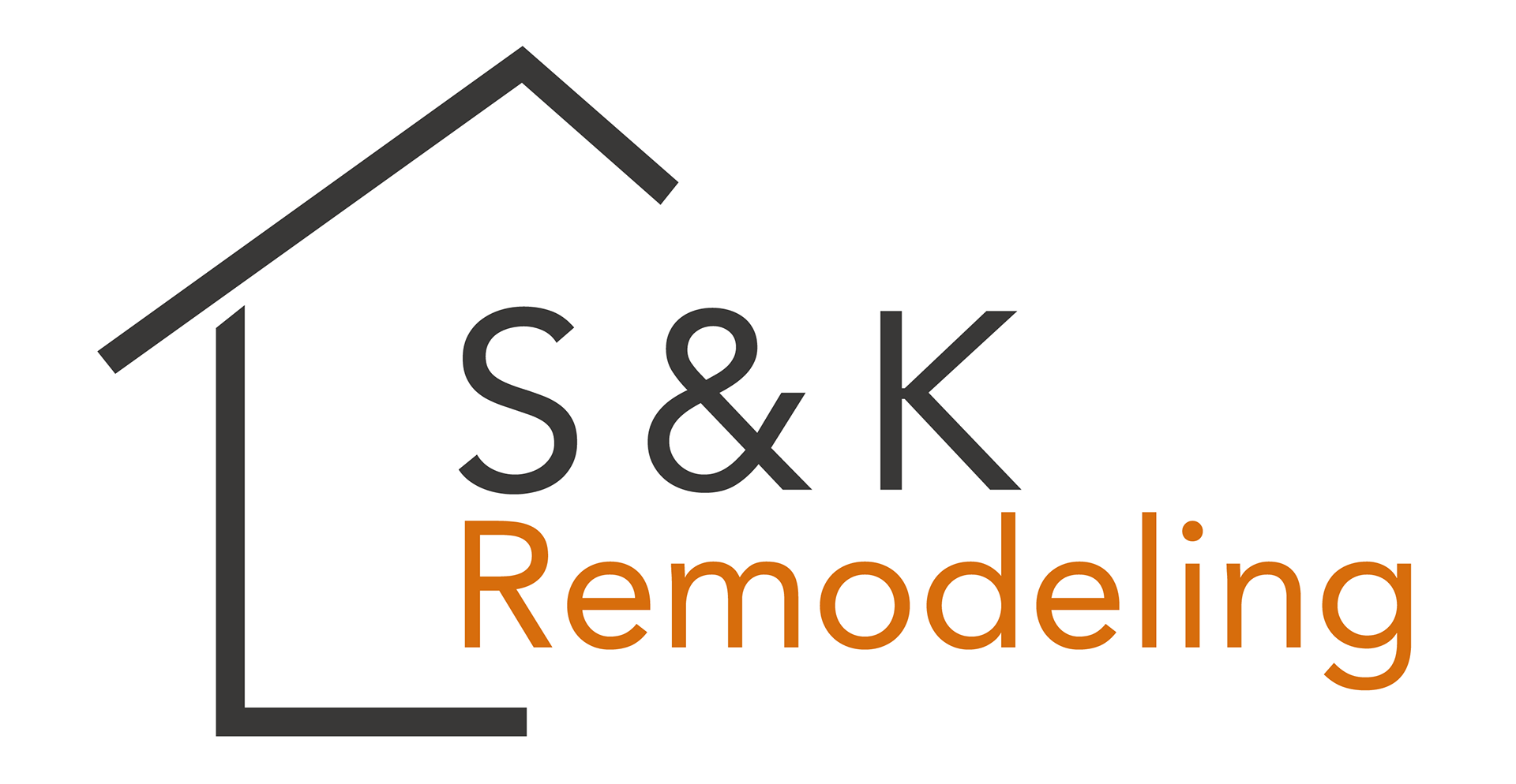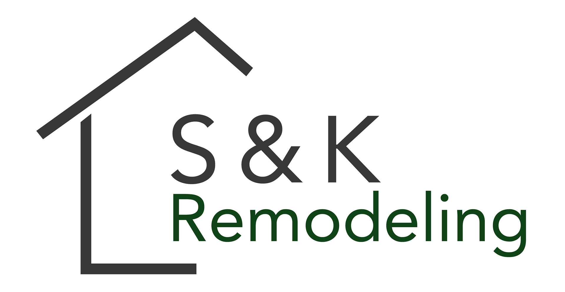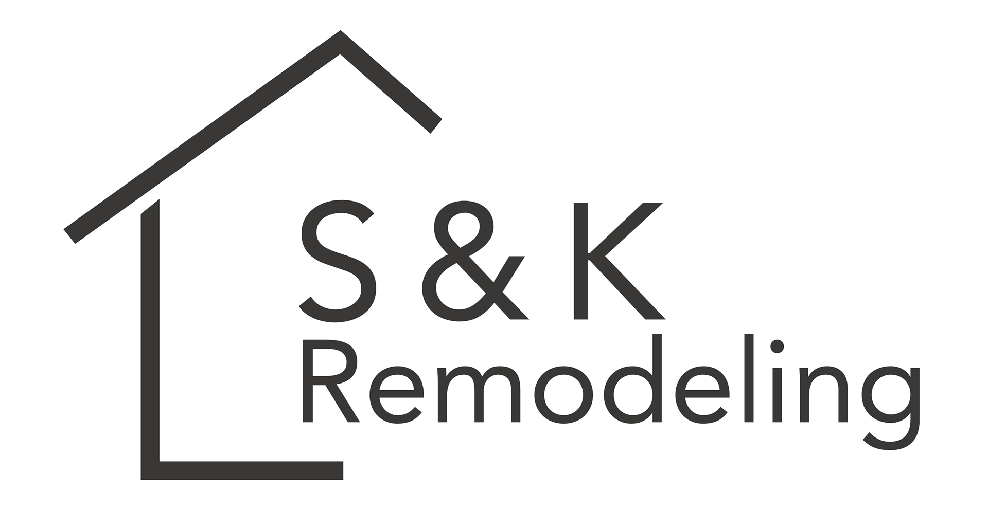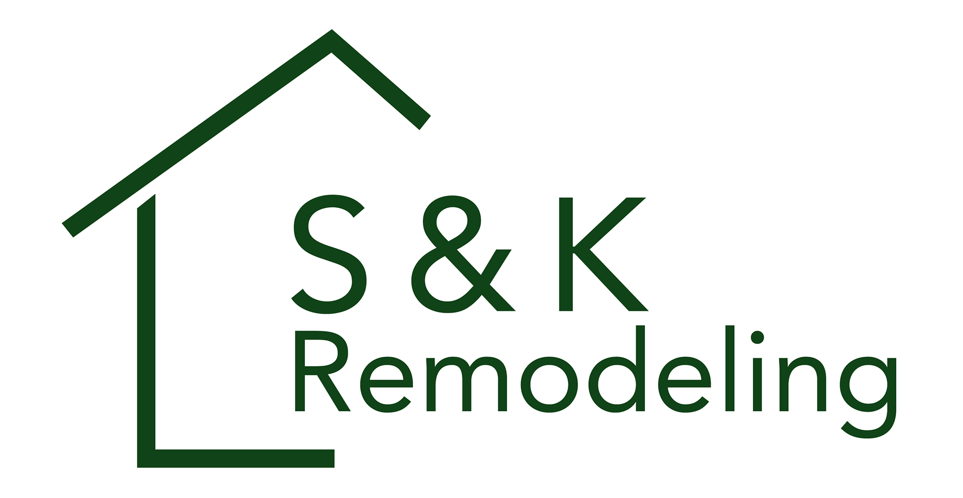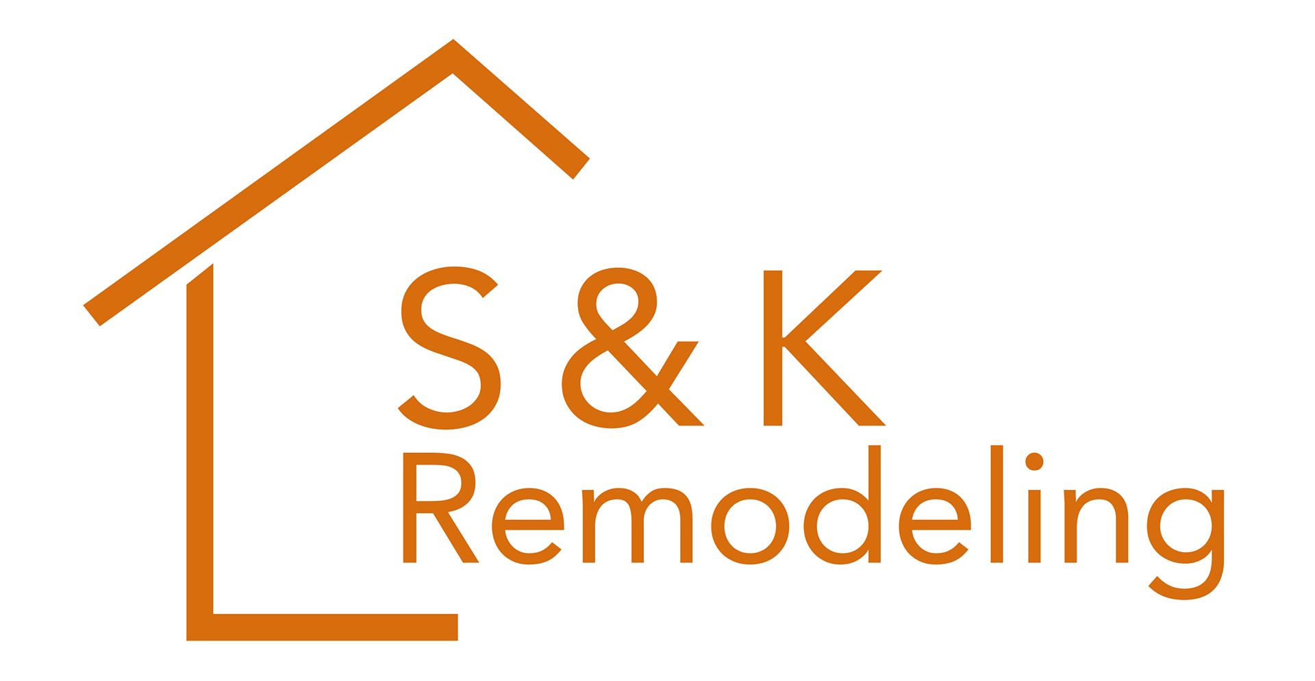
A client wanted a sleek and modern logo for his new remodeling company. He already had a couple ideas in mind for what he wanted the logo to look like, and asked for my input from there.
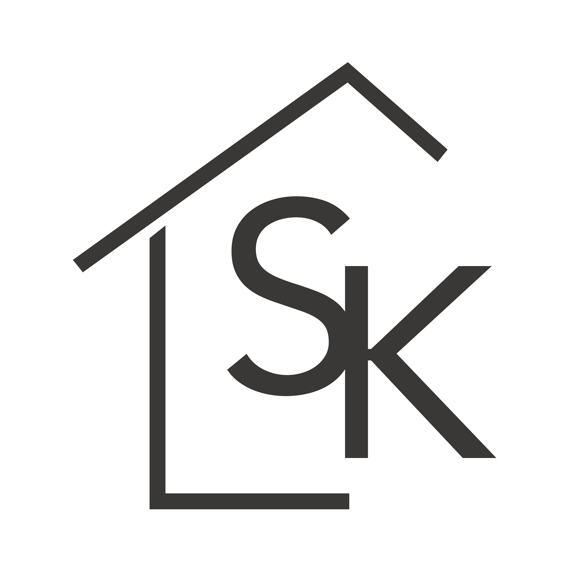
The ideas he had were a house outline with his initials in the house, as well as a way for the whole title "S&K remodeling" to be oriented within or around the house. Below are the iterations we went through before the final logo.
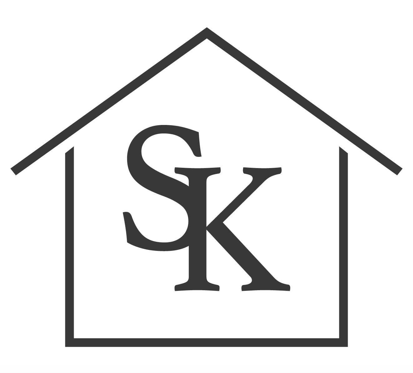
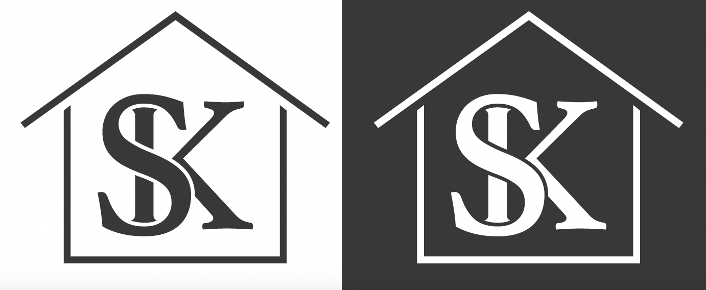
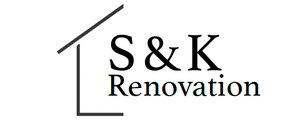
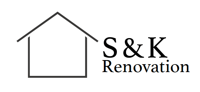
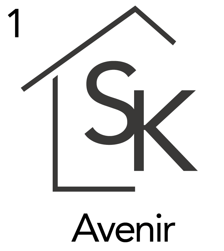
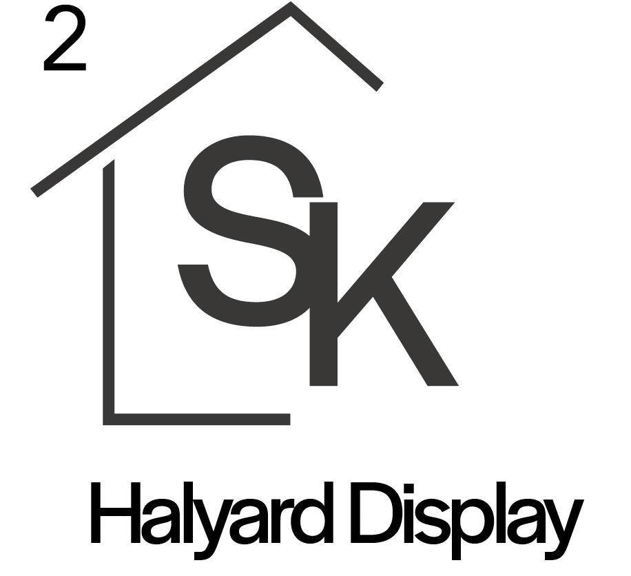
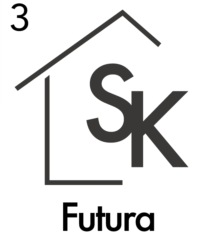
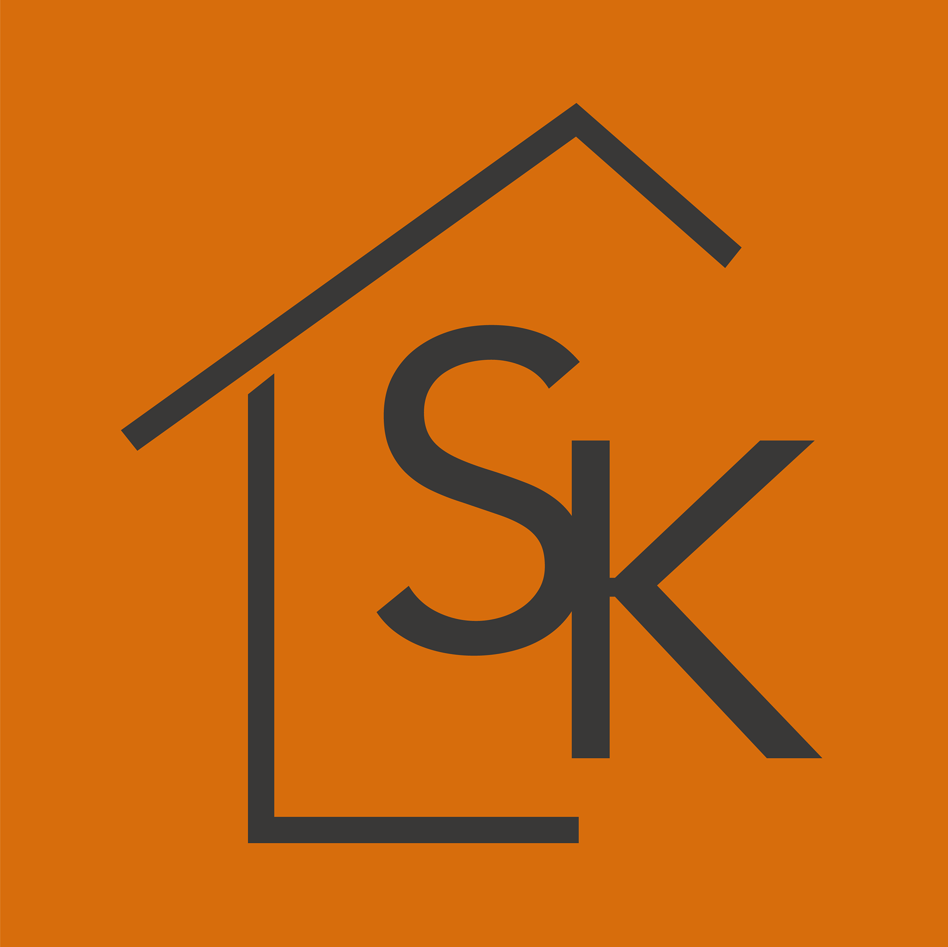
I started with a serif font and a full housing design, but when told by the client he'd rather have a sans-serif font and more of an implied housing design. I then sent the last couple of iterations at the bottom. The client decided to go with the font Avenir and the housing seen in the first iterations. Below are the final horizontal logos, and the frontal logo is above.