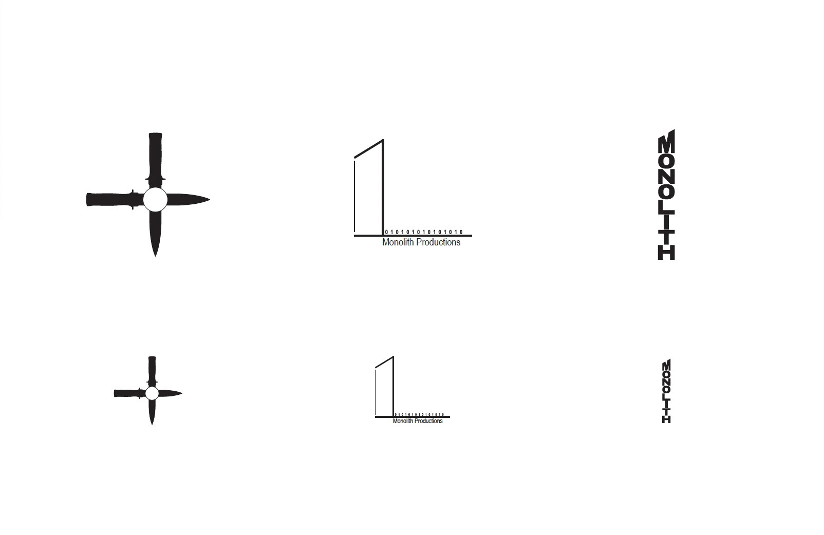
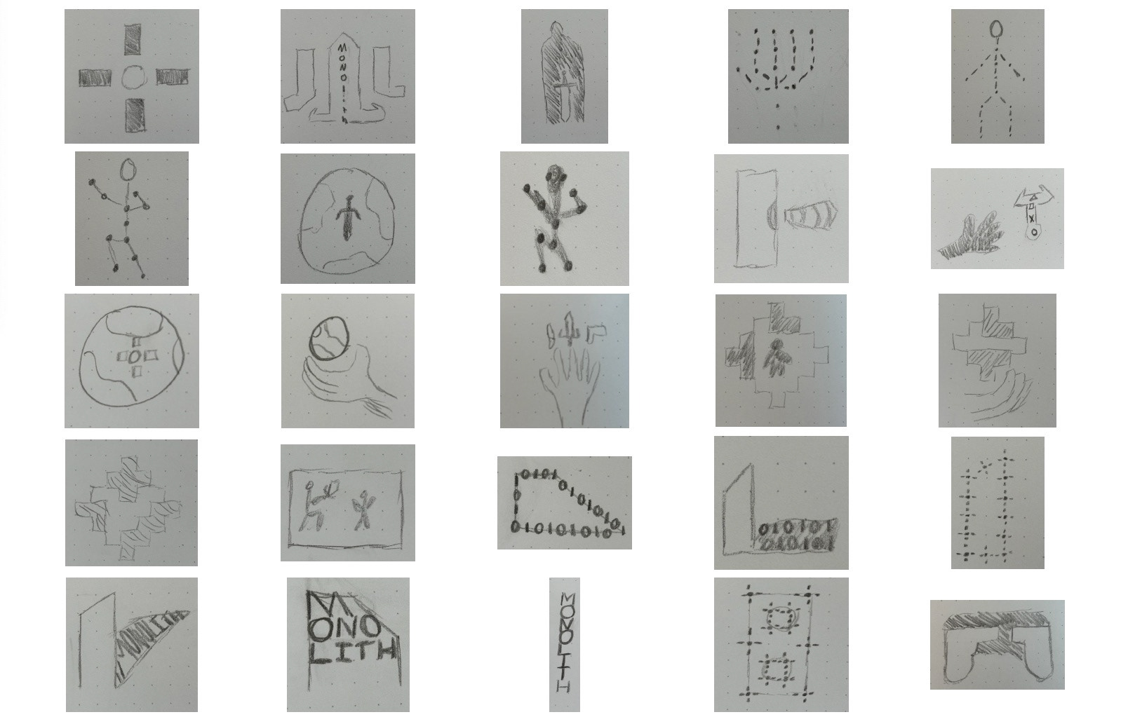
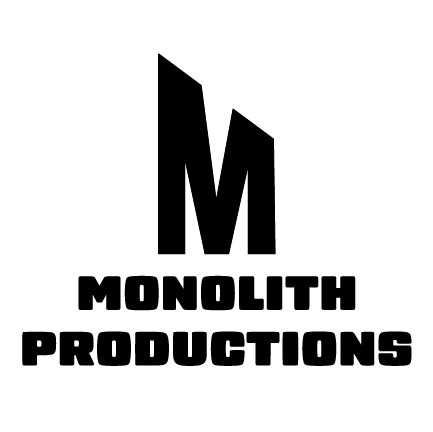
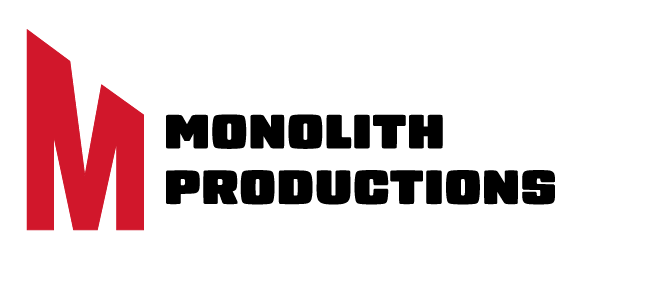
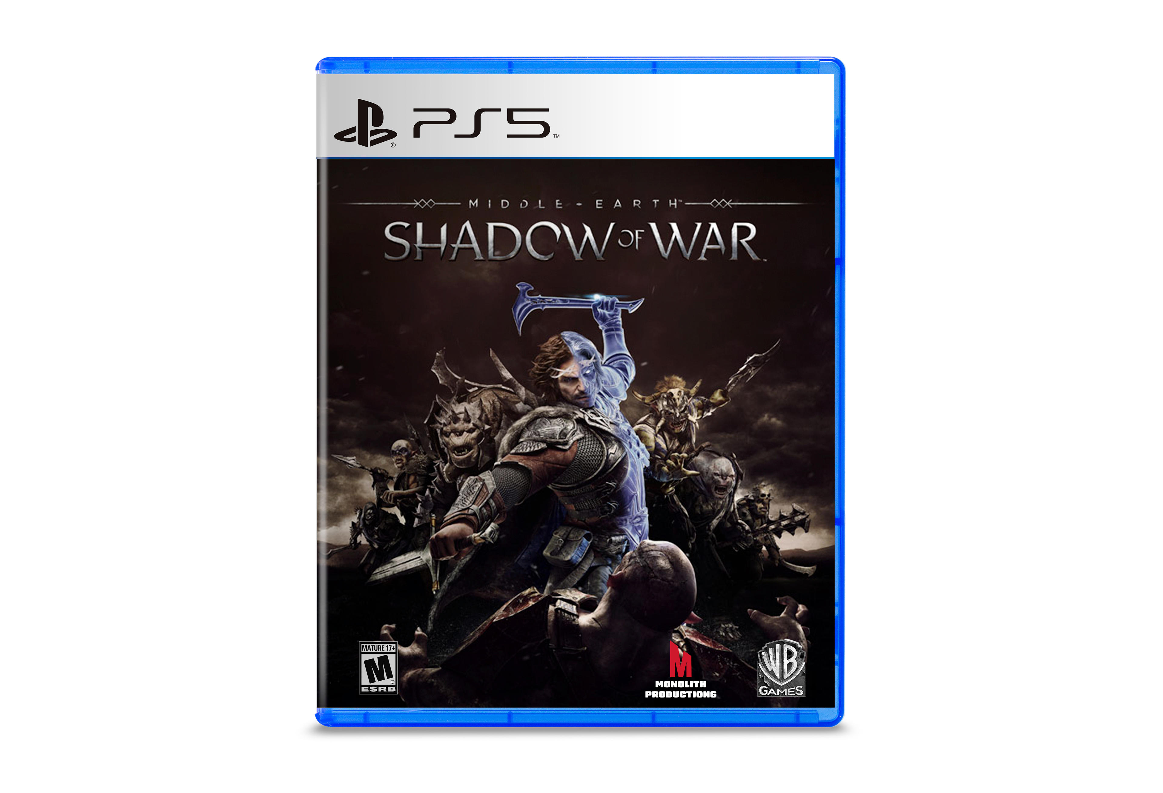
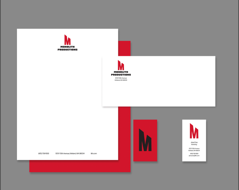
Taking an existing “third tier” or lesser-known company I was tasked with a full rebranding; including colors, font, and logo. I chose Monolith Productions as my company, after coming up with 25- sketches of different logo options a peer critique was done to narrow the possible logos to two. After further critique, the M in the shape of a monolith was chosen as the logo.
